Showing posts with label nails. Show all posts

July 10, 2011

Duochrome Golds

Tonight I went ahead and used some oldies but goodies.
The eyes looked so much better irl, but I only got pictures after the good lighting was gone hence the flash.
I found that Moonlight Night (from Tartan Tale) + Old Gold make an amazing combo. I need to play around with these two colors.
The nails are also one of those things that looks better in real life. I used duochromes that have the same back color (green). One is pink and green (from Sally Hansen), another is silver-purple and green (OPI Katy Perry), and the other is gold and green (Chanel Peridot). There is black laced throughout the marble.

Photobucket

Photobucket

Photobucket

March 15, 2011

St. Paddy's Day Nails

I thought that I would go ahead and give my rendition of the gradient nail tutorial. I usually clean up my nails the morning after doing them.

Photobucket
Photobucket

Theory:
The tutorial that I first used had a transparency/opacity gradient and a slight light gradient (glitter). This tutorial has 3 dimensions: shade/hue, analogous hues, and transparency/opacity.
These three things need to be taken into consideration if you're going to alter the colors because you need to have the right type of formula. For instance, you might not want to lay down your transparent color first and then put your fully opaque colors on top because it might be harder to get a fade. If your doing the analogous hue shift and shade/hue shift, you also might want to consider which is the cooler of the colors is cooler and which one is warmer. Some warm colors have very murky shades (think yellow+black) whereas almost all cool colors have vibrant shades.

Ok, so onto the tutorial:
Step One: Get a base coat on.
Photobucket

Step Two: Add a full on black base. The best black polish for this IMHO is Sinful Color's black polish.
Photobucket

Step Three: Mix a bit of transparent teal and a cheap clear polish or if you have transparent micro glitter polish use that. Take the darkest green and bring it up 3/4 of the nail. Use the transparent teal polish to cover the rest of the exposed black and go slightly over the dark green.
Photobucket

Photobucket


Step Four: Take a green that is closer to the hue and a little more yellow and bring it 1/2 way up the nail. At this point you can slightly go over the line with the dark green to help the colors blend.
Photobucket

Photobucket

Photobucket

Step Five: Once this has dried a bit, I take the yellow green and put a bit of it down like a tip. I let it get a little tacky before blending it out with a glitter polish that has both peridot colored glitter and emerald colored glitter.
Photobucket

Photobucket

Photobucket

Step Six (Optional): Add a black french tip. I will do this one today:D

Step Seven: Top Coat
Photobucket

March 2, 2011

Gradient Nails

I did my nails several days ago following a modified version of Celly's nail tutorial: http://www.makeupbycelly.com/2011/02/tutorial-gradient-nails.html
Queen of Blending has a similar nail tutorial with glitter polish and rhinestones which is the one that I used to this point:http://www.youtube.com/watch?v=TTVR1tDoHsc

It is a gradient nail that starts neutral and gets more intense as you get closer to the tip of the nail. I used black as my neutral color and made a fade from purple to red-violet. I used a nail polish by ORLY that has a pinkish micro glitter to tie the colors in with each other and finished off with a black french tip.

Photobucket

Photobucket

Also, dinner was nice tonight. I made chicken with herbs and added it to pasta with feta and a dash of meyer lemon. Once I was finished cooking everything I added some arugula. I had made a winter fruit blend for salad, but I put some of it into the pasta. That's why there's grapefruit and blood oranges in the pasta.
Aaah yeah.
Photobucket

January 27, 2011

Collection Remix: Naughty Nauticals

This collection from May 2008 was inspired by colors traditionally worn by sailors with a resort twist. Most of the eyeshadows and quads focused on cool eyes with a glint of gold. While most people were fawning over Bell Bottom Blue and Mutiny pigments all of my attention was on Port Red.

Photobucket

Photobucket

December 27, 2010

After Christmas Collections and Dupes

I am back from my mini vacation. Today I went down to check out the after Christmas collections and something really struck me. This really seems like the Riveting Collection cut in two. The mix of the metals, frosts, and pop of bright colors is what did it for me (although Riveting did have more matte colors). But onto the collections.

Cham-Pale
Photobucket
Very Important Plaitnum (left) and Soiree (right)
Photobucket
Revlon Steel-Her Heart (left) and Revlon Silver Screen (right)

I expected to like nothing from this collection and I was almost dead on except for falling in love with the nail polishes. I found that Soiree reminded me of a shiny gold version of Studded (silver from Riveting). I also liked Very Important Platinum, but it reminds me too much of Revlon's Steel-Her Heart and Silver Screen which also have very poor drying times. I guess it's just something about metallic polishes.
I also decided to pick up Feline eye kohl as I need a new black pencil and everyone raves about this one.

The Highlight Powders were way too glittery with too little pay off. The paint pots are nothing new under the sun as there are some shadesticks in those colors.

Stylishly Yours
Photobucket

I was also looking to avoid a lot from this collection. I only was interested in the paint pots and that's all I got. I tried the Beauty Powders, but they were very boring. I find that if I need subtle shimmer, I will stick to other products like the magically cool powder. I got Dark Diversion (bottom) and swatched it next to Macroviolet (top).

October 7, 2010

Basic Tartan Nails

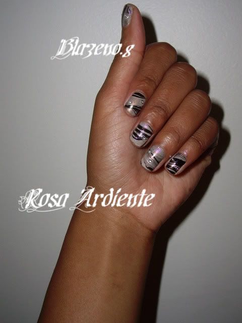
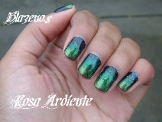
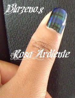
I remember that when I started this blog, I was interested in making tutorials. I haven't really kept up on that, but hopefully this one comes in time for A Tartan Tale for those of you who want to go with plaid nails. I never thought the day would come when I would attempt a look based on Blackwatch Plaid. Sorry, no argyle tutorials.

Photobucket

For this look you will need:
Base Color
Contrast Color
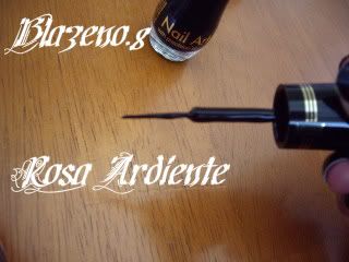
Accent Color (some plaids have 2, but however many you have, you will need a thin brush)

Try to get colors that are creamy and opaque. Shimmery colors and sheer colors are very difficult to work with. If you have nail art supplies at home, you can really use any color you have by putting it onto a palate and then getting the appropriate brush size for the task.

1) Start out with a fully dried Base Color. Balackwatch plaid is a forest green so you can use either a deep teal or a dark green.
Photobucket

2) Take your Contrast Color and make 2 stripes across your nails so that you have 4 evenly spaced stripes. For Blackwatch this will generally be a blue.
Photobucket

Photobucket

3)Take your Accent Color and make a thin stripe in the center of either your Accent Color or your Base Color, but not both. Most plaids and tartans have a bright color like white, blue, or red. Blackwatch generally has a black Accent Color which is why it's so hard to photograph (but it does show up IRL).
Photobucket

Photobucket

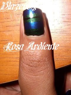
4) We've been working with horizontal stripes up until now, but here's where the vertical stripes come in. Taking your accent color go down the outer edge of the nail in 2 thin stripes. Rotate your nail to the other side and do the same. You should have 4 vertical stripes that are very close to each other, but allow the other colors to peek through between them.
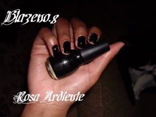
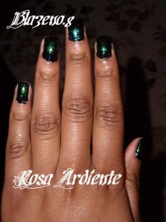
Photobucket

Finished.
Photobucket

Photobucket