October 24, 2010
Run Ke$ha Run
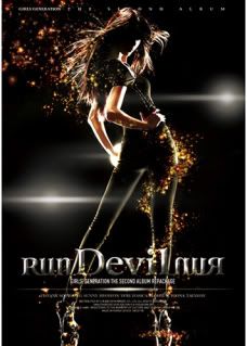
I will admit it, I am an occasional listener of K-pop. One of my favorite girl groups, Girl's Generation (소녀시대 aka SNSD), was featured in a mashup which I found kind of eerie. Normally when we find a mashup, it seems like a strange coincidence that two different songs overlap so well. Take for instance, the Lady Gaga "Just Dance"/Kat deLuna "Whine it Up" mashup.
But there are other mashups which over lap well because we're really dealing with the same song. I'm not talking about one artist covering another artist's song, I'm talking about a new song being released by two artists around the same time. This is exactly what happened with "Run Devil Run".
Ke$ha actually had made a recording of "Run Devil Run" which sounded quite official. SNSD later released a very similar sounding song. I mean sure, the SNSD lyrics are in Korean and Ke$ha's are in some form of auto-tuned American Engli$h but if we listen to the musical score, there was obviously no one artists covering another. In this case, the song actually belongs to SNSD because SNSD purchased the copyright before Ke$ha did, but Ke$ha had recorded her demo before SNSD bought the copyright as it was originally intended for her album Animal.
So much for Ke$ha's originality I guess.
October 22, 2010
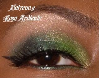
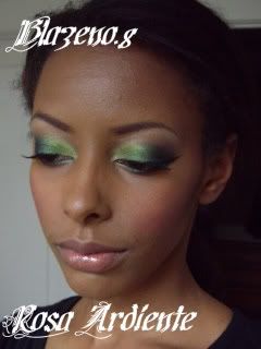
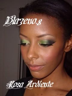
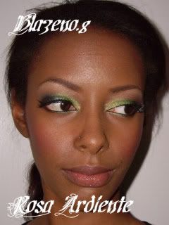
Evergreen Eyes on Her Blushing Cheek
I wanted to make a post that shows the color of Her Blushing Cheek and of Moonlight Water.
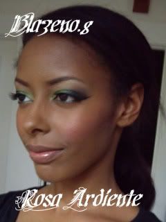
As we all know, glitter show up best IRL, and it tends to show up as purple and pink flecks on the camera which doesn't look good when paired with green. The hightlight color is a mix of Vanilla pigment and Quick Frost from Rushmetal. It's a greenish white with what appears to be little transparent teal flecks in it (possibly reflects gold, but I'm not sure). Next time I will try a more exciting shape as I've gotten in the habit of doing a very basic eye.
Natural Light:
Soft Flash:
October 21, 2010
A Tartan Tale Teals
Today I went to swap out The Family Crest for Moonlight Night.
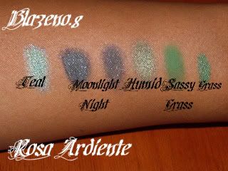
Here are some comparison swatches to show that the pigments available in this collection tend to be teal and not straight up green. The Beauties Play It Cool eyeshadow kit has a kelly green in it that reminded me a lot of Urban Decay's Grass. Remember that if you don't have Teal pigment yet, you can get it in one of the lash kits that comes out with this collection. All swatches are over Urban Decay Primer Potion.
Left to Right:
Teal pigment
Moonlight Night wet (LE A Tartan Tale)
Moonlight Night dry (LE A Tartan Tale)
Humid
Sassy Grass (LE Dare to Wear)
UD Grass cream shadow
October 20, 2010
A Tartan Tale Violets
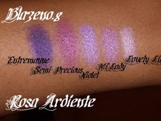
Purple swatches from Tartan Tale. Remember that if you don't have Violet pigment, you can get it in an eyeliner kit from A Tartan Tale.
From left to right:
Entremauve pigment (LE Nocturnelle/Formal Black)
Semi-Precious (LE Tartan Tale)
Violet pigment
Mi'Lady: purple side (LE Antiquitease)
Lovely Lily pigment (LE Naughty Nauticals)
From left to right:
Entremauve pigment (LE Nocturnelle/Formal Black)
Semi-Precious (LE Tartan Tale)
Violet pigment
Mi'Lady: purple side (LE Antiquitease)
Lovely Lily pigment (LE Naughty Nauticals)
Comparison Swatches
Comparison Swatches of Impassioned and Full Fuchsia. I find that these swatches aren't the most telling, but generally, Impassioned is much more coral. Full Fuchsia is a blueish pink. They're very different IRL.
Impassioned
Full Fuchsia
Full Fuchsia and Radiant Jewel
On Style Minx vs. Radiant Jewel:
Style Minx is similar to Radiant Jewel, but it's more of a hot pink and it's more opaque. Radiant Jewel is a bit more transparent, but it's more opaque than your run of the mill Dazzleglass (because it's a Dazzleglass cream). It has a bit more of a reddish/blue-pink tone and the glitter particles in the Dazzleglass are more prominent than in Style Minx.
A Tartan Tale
So I had the chance to go to the unveiling yesterday and it was amazing. There were nice snacks and a fiddler who was accompanying the soundtrack that was playing in the store. The waiters were also in costume which is always fun. :) The place was packed and I'm glad that I knew what I was interested in that means that I could get in and get out very quickly. We got a little story book with the concept of A Tartan Tale and we got tartan cloth pins. :)
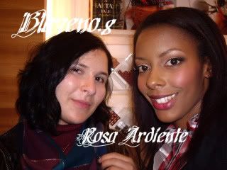
Me waiting in line with my friends.
I saw the quads and prepackaged brushes and I wasn't that impressed. I think that some of the eyeshadow quads were nice, but I am just against buying them in the first place because of all of the repeats. I ended up buying only things from the color collection.
The texture of the eyeshadows are amazing. They're very soft and buttery and I imagine that they can be used like pigments when mixed with a bit of mixing medium. I bought Semi-Precious and plan on pairing this with Violet pigment. I passed on the other ones because many of them seemed to light for me (I like midtones) or just didn't stand out.
I got Moonlight Night pigment which is a gorgeous dark green. It's very hard to find good greens and I think that this is great deep green. I plan on using this to deepen up humid and will use it with eyeshadows like Humid and Eyepopping. Even some teals and yellows. I wanted to like The Family Crest, but I actually have Guerlaine's loose eye kohl in brown which I find to be a better color. I passed on Later from Alice and Oliva and I decided to pass on it again. It reminds me too much of Entremauve/Push the Edge mixed with Dark Soul.
I tried both My Highland Honey and Her Blooming Cheek. I found that My Highland Honey was a cute color, but very run of the mill and probably not the most flattering for my skintone. I can imagine that very many people will be afraid of a bright color like Her Blooming Cheek, but when applied with a light hand, it is so incredibly beautiful and gives a nice pop of color. Moderation is key.
Of the Dazzleglass cream, only one stood out to me which was Radiant Jewel. I didn't even try the others, but that was mainly in part due to lack of lip brushes to try the products.
The lipsticks were very nice. I compared Impassioned and Full Fuchsia and they were different (which made me glad). Impassioned is much more of a coral and Full Fuchsia is just that, bright fuchsia. Deepest wish was nice, but I think that there are other colors that are similar to it in the permanent line. The other colors didn't really catch my fancy because I'm an amplified cream person, not a glaze or luster person.
I didn't try the pearglides because I don't like the texture and I didn't try the nail polishes because none of the colors caught my fancy.
The FOTDs include Her Blooming Cheek and My Highland Honey blended together and Radiant Jewel over Full Fuchsia.
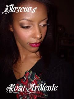
And just for kicks, here is what my toenails looked like. Robert Burns style plaid.
Me waiting in line with my friends.
I saw the quads and prepackaged brushes and I wasn't that impressed. I think that some of the eyeshadow quads were nice, but I am just against buying them in the first place because of all of the repeats. I ended up buying only things from the color collection.
The texture of the eyeshadows are amazing. They're very soft and buttery and I imagine that they can be used like pigments when mixed with a bit of mixing medium. I bought Semi-Precious and plan on pairing this with Violet pigment. I passed on the other ones because many of them seemed to light for me (I like midtones) or just didn't stand out.
I got Moonlight Night pigment which is a gorgeous dark green. It's very hard to find good greens and I think that this is great deep green. I plan on using this to deepen up humid and will use it with eyeshadows like Humid and Eyepopping. Even some teals and yellows. I wanted to like The Family Crest, but I actually have Guerlaine's loose eye kohl in brown which I find to be a better color. I passed on Later from Alice and Oliva and I decided to pass on it again. It reminds me too much of Entremauve/Push the Edge mixed with Dark Soul.
I tried both My Highland Honey and Her Blooming Cheek. I found that My Highland Honey was a cute color, but very run of the mill and probably not the most flattering for my skintone. I can imagine that very many people will be afraid of a bright color like Her Blooming Cheek, but when applied with a light hand, it is so incredibly beautiful and gives a nice pop of color. Moderation is key.
Of the Dazzleglass cream, only one stood out to me which was Radiant Jewel. I didn't even try the others, but that was mainly in part due to lack of lip brushes to try the products.
The lipsticks were very nice. I compared Impassioned and Full Fuchsia and they were different (which made me glad). Impassioned is much more of a coral and Full Fuchsia is just that, bright fuchsia. Deepest wish was nice, but I think that there are other colors that are similar to it in the permanent line. The other colors didn't really catch my fancy because I'm an amplified cream person, not a glaze or luster person.
I didn't try the pearglides because I don't like the texture and I didn't try the nail polishes because none of the colors caught my fancy.
The FOTDs include Her Blooming Cheek and My Highland Honey blended together and Radiant Jewel over Full Fuchsia.
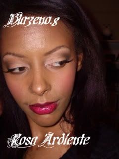
And just for kicks, here is what my toenails looked like. Robert Burns style plaid.
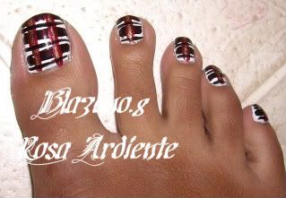
Wrong Spell FOTD
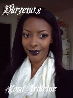
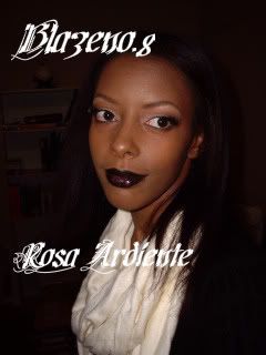
I decided to make this into two posts. I have been meaning to wear Wrong Spell for quite some time now, but I just haven't gotten around to it. This is a fairly neutral look using dark spell. There is no lip liner (which would have made the look dead on) because I was on my way to the unveiling of Tartan Tale.
October 11, 2010
Fall Joys: Food Version
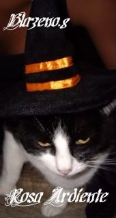
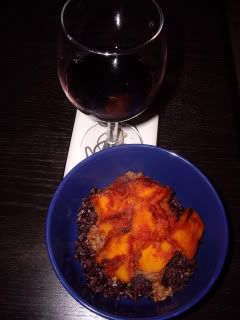
Another gratuitous cat photo (she got a new hat over the weekend and I had to share). Zorro and I have something in common: we love a good meal. Over the weekend I made a colorful rendition of a dish that's based off of the Afghan dish Kadu Bouranee (with lamb sans yogurt). The tomato sauce and pumpkin gives a very beautiful fall color pallet and the black rice made it fun enough for Halloween. Not to mention that the flavor of the black rice and basmati played together in a savory medley with the rest of the dish. Try paring this dish with a rich red wine and you're good to go, but it's also great without wine too.
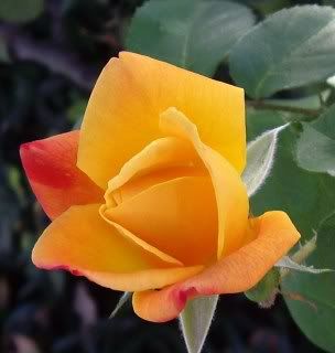
Oh and just because it fits the color scheme, there is a beautiful rose bush that is in bloom which has colors that are apt for fall.
October 7, 2010
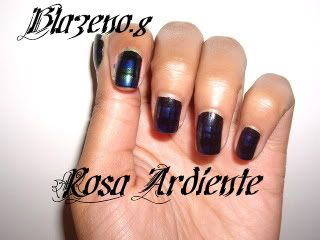
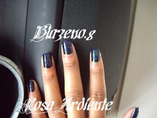
Basic Tartan Nails
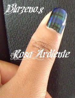
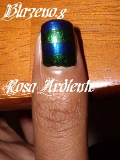
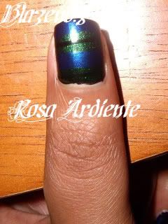
I remember that when I started this blog, I was interested in making tutorials. I haven't really kept up on that, but hopefully this one comes in time for A Tartan Tale for those of you who want to go with plaid nails. I never thought the day would come when I would attempt a look based on Blackwatch Plaid. Sorry, no argyle tutorials.
For this look you will need:
Base Color
Contrast Color
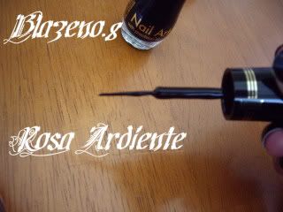
Accent Color (some plaids have 2, but however many you have, you will need a thin brush)
Try to get colors that are creamy and opaque. Shimmery colors and sheer colors are very difficult to work with. If you have nail art supplies at home, you can really use any color you have by putting it onto a palate and then getting the appropriate brush size for the task.
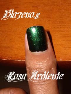
1) Start out with a fully dried Base Color. Balackwatch plaid is a forest green so you can use either a deep teal or a dark green.
2) Take your Contrast Color and make 2 stripes across your nails so that you have 4 evenly spaced stripes. For Blackwatch this will generally be a blue.
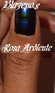
3)Take your Accent Color and make a thin stripe in the center of either your Accent Color or your Base Color, but not both. Most plaids and tartans have a bright color like white, blue, or red. Blackwatch generally has a black Accent Color which is why it's so hard to photograph (but it does show up IRL).
4) We've been working with horizontal stripes up until now, but here's where the vertical stripes come in. Taking your accent color go down the outer edge of the nail in 2 thin stripes. Rotate your nail to the other side and do the same. You should have 4 vertical stripes that are very close to each other, but allow the other colors to peek through between them.
Finished.
October 6, 2010
Wrong Spell
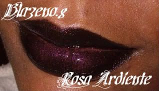
Wrong Spell and Black lipstick:
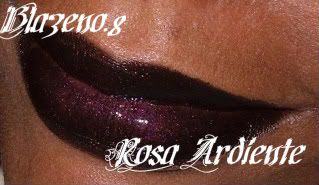
Wrong Spell alone:
I only bought one thing from Venomous Villains "Wrong Spell" because (in addition to being underwhelmed) I am holding off for a Tartan Tale. I was invited to the TT launch party near me and I am really excited to all of the different products. I will be sure to upload pictures after I go and give a small review.
Subscribe to:
Posts (Atom)